My WTF moment with AdSense-Deluxe plugin
SandboxBlogger April 3rd, 2007Today, I had a WTF moment when I was adding AdSense code to SandboxBlogger.com theme. Naturally, I install Wayne’s AdSense-Deluxe Plugin for WordPress to make it easy on myself. I’ve made the choice simply because AdSense-Deluxe Plugin is the best plugin out in the WordPress plugin jungle (more about that in later post).
In the past, I have been avoiding ads in posts on my other blog that I either participate or have helped to setup. All for the name of unintrusive ads, in fact too unintrusive… This time around I wanted to be a little bit bolder in my ads arrangement. However, I did not want those post ads to show up in my home page, archive pages, or any non-single pages in the blog. Ahh… Good! AdSense-Deluxe allows me to turn them off with just a few clicks to unchecked the related check box.
Then I saw it.

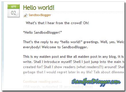
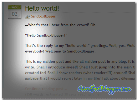
WTF is there a gap screwing up my alignment?!

As it turns out, I wanted to make the post text wrap around the ads. Also to place a little more space around the ads so that my post text will not be too close to the ads. Without thinking, I went ahead to add a pair of DIVs around the AdSense-Deluxe commented codes in the post. Well, AdSense-Deluxe did its job by not replacing the HTML comment with AdSense code, but that leaves a pair of empty DIVs that naturally takes up space…
At this point, I was still in the WTF moment, franticly digging into AdSense-Deluxe code to see if I can somehow fix it to also handle the pair of DIVs around the AdSense code block. Should I hack it to use a special form of the comment code so that AdSense-Deluxe will recognize how to add the pair of DIVs around the AdSense code blog? I was thinking to myself.
It was only after a few hours that I realized that WTF! I could just add the pair of DIVs along with the AdSense code block in the AdSense-Deluxe options page! WTF do I need to place the pair of DIVs in the post!?
<div class=”adsclass”>< … adsense block …></div>
Talk about feeling stupid…
October 3rd, 2007 at 5:48 am
You are awesome. I was having the same duh moment, did a quick search and I found you. I really didn’t want to go through the adsense_deluxe code and figure all of that out. Thanks for posting your genius.
October 3rd, 2007 at 10:59 am
Hi The Maestro,
So, it is not as rare as I thought. 😀
I’m glad my solution is helpful. I won’t call it genius though. 😉
July 22nd, 2009 at 3:16 am
Going to give this a try but will ym code be in place all the time, i used all in one adsense and that basically every 8 hits uses the creators own adsense code. So was robbing me of cash
July 23rd, 2009 at 11:18 pm
nas,
Adsense Delux have an option to turn on or off the developer code. So you are in control of that.